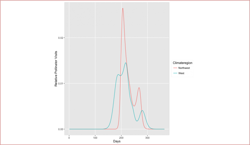
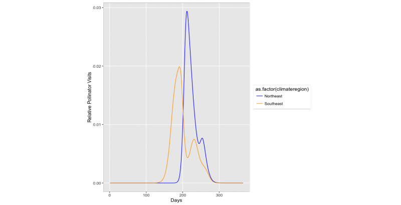
These curves represent the expected pollination service across the year in different parts of the country. We use these to calibrate your pollinator count. For example if someone in San Francisco saw 5 bees in May during the pollination peak and someone else saw 5 bees in October when pollinators are not very common, we would know that the October count represented much higher annual pollination service. Day 200 is around July 16.
Here are curves for the Northeastern and Southeastern United States. Notice that there is a big peak in spring and then a small bump for the fall bees that like to visit composites in the daisy family. You can also see that the pollination service starts earlier in the South than the North.
These are the curves for the Northwest and Southwest. They have similar patterns to the Eastern US but have larger fall pollination service .